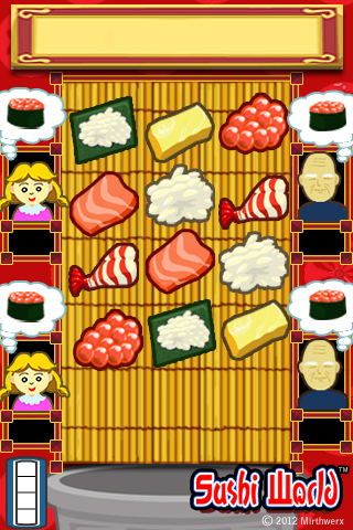
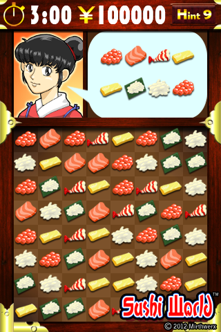
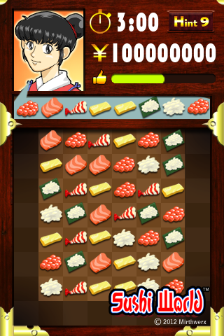
Sushi World believe or not started way back in 2009. We want to create a game that you can experience being a sushi chief, taking care of your customers, manage your ingredients and master your skills with different sushi combinations. We went through series of design phases about the game and its game play. Below is our very first prototype back in 2009.
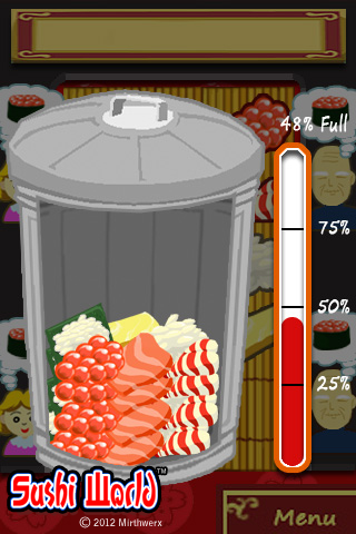
We had 4 slots for different customer types, and thought bubbles of what sushi they have ordered. Also there is a garbage can at the bottom for manage your ingredients. The new ingredients will only come into the empty space on the main area, which means you either use it to create a sushi for a customer or you need to throw it in the can. But beware if you fill the can, you will get FIRED (GAME OVER) from the manager.
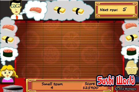
so, managing ingredients and customers with your quick thinking about which sushi to make for which customer first. All these elements combine, we thought it will be a quick, fun game… soon we found out the play area need to be bigger. We need more ingredients to beef up the strategy, so here comes the 2nd attempt for the game screen.
reduce the size of each ingredients so we can fit more on the screen, and reduce the number of customers but give you 3 sushi choices from each.
After hours and hours of play/testing… we felt the game is missing something, something that we couldnt pin point, although everyone in the studio loves the idea but we have no choice but to freeze the game and go back to it when we know what to do with it. Plus at the time “Catch the Monkey“ game design was ready and waiting in the pipe line so we went ahead with it.
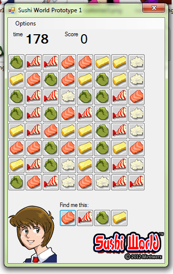
2012, after we had done with many versions of CTM, we finally went back to Sushi World. This time we had brand new ideas and game plays, 15 mints into the game design meeting we are already super excited about Sushi World again. First prototype was done within weeks, and we love the new and improved game play.
while playing hours and hours of the new Sushi World on PC, we soon recognized the game will be on your IOS devices, customer head and receipts will be blocked by your hand from tapping on the ingredients on the top of the screen. We know we have to move them.
At this point, we are all very happy with what we have, the graphics/style is dead on and moving the interface up just felt right. But after testing it on new player we soon found another problem… that is the 2 lines of receipt, is not very clear to the player which ingredients to look for first, so onto the design board again.
This is the final design, the receipt is in one nice line, crystal clear no confusion and everything fits nicely beside the customer head.
So there you have it, the long and crazy road that we took to come to this final design of Sushi World. If you haven’t try our prototype demo, please come and see for yourself HERE.
Hope you enjoy it, and let us know what you think about the changes that we made, and do you like it?


