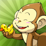
As we are still waiting on Apple’s review (come on Apple speed it up :(), I thought I would share the design process of “Catch the Monkey” app icon.
 We knew what the icon would be right from the beginning: “laughing monkey head”. So I went off and start searching through all the monkey drawings. We nailed it down to 2 and eventually agree on the one from our title screen.
Once we have decided on the monkey, the rest is the effects that go with it; below is the my first attempt:
We like the look; nice, clean, colorful, but it’s lacking “excitement”…
2nd attempt:
This time around I dressed it up some more in the background. This achieved the feel that we want the icon to convey.
We love the background effect, it sure feels exciting. I was inspired by the Simpson’s episode “Mr. Sparkle” 😀
Although we are happy with it, it is in my nature to give it another try, you never know it might just be even better than this one.
3rd attempt:
I played around with different back drops, none of them is better than the sun ray effect so I direct my attention to other elements…
I dont know why but without the white frame the icon seems to be more “free”, more “out of box”, feels the excitement is amplified 😀
Out of these 3 color the initial pick is easy, red is out almost instantly because of how the monkey’s color is blending into the red.
Blue and Green are the ones that we had debated for a while. In the end green wins because is more “friendly, bright” and stands out compared with other app icons we’ve seen.
Final
so there you have it folks, look for this happy monkey icon in the app store soon 🙂


